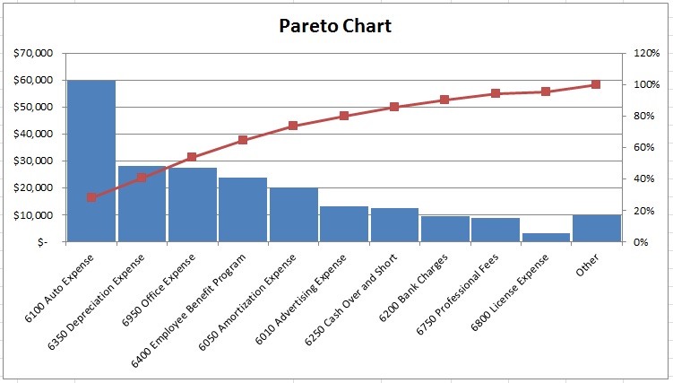
OK, so you’re running along in your business and you figure out you need to find a way to cut some expenses. One of the first things I would do is put your expenses into a Pareto chart so you can visualize the top expenditure accounts which are going to be your largest opportunities. We joke about this and call it “whack-a-mole” because it’s always focusing on cutting the bucket that sticks its head above the rest.
The 5 Sentence Splash: Quick Summary of the Tool
Insert your expenses or income accounts from the P&L into the template. Mess with the Ignore and Cumulative Thresholds to make cuts at seemingly natural thresholds if there are any. That’s really it. Often times it’s worth doing a second layer of drill down Pareto on your top expenses as you dig in. I’m adding this fifth sentence so you get the idea how simple this really is!
How To:
Put your P&L Expenses, COGS or Income accounts into the template’s orange input cells. I’d recommend you don’t mix account types and I’d recommend not using top-level Totals categories along with the accounts in those categories since you could be showing the same numbers twice.
Pareto Chart Template Download
You can mess with the Cumulative Threshold if you want to change the chart look and feel. You can also use the Ignore Threshold, but using that feature should be fairly rare.
Use the results of the chart to help you know what categories are most worth your focus. Focusing on shaving costs in the smaller categories may no result in as many savings as focusing on the larger categories.
Extensions
You can use Paretos for any type of data, not just financial data.
- Sales volumes by category
- Customer demographic data
- Lost customer survey results
- Types of final transactions for lost customers
- Website dropoff points
- Time spent by activity type
- Labor hour categories
Often the largest few categories should be drilled down. Make a second Pareto of the breakout of the largest bars until you can identify which sub-categories can be cut or reduced.
Limitations
Whack-A-Mole
Often times this can cause a focus on the largest investments of the company. One could argue that the largest investment, if strategic, should not be the focus of cost reductions. I have unfortunately seen this occur all too often. This causes many managers to game the system by splitting their expenses into smaller buckets so as not to be the largest bar on the chart.
Category Issues
The usefulness of this tool is only as good as your data categorization. If you have one category with more than 50% of your spend in it. You probably need to split things out a bit more, or at least be able to drill down into that category.


Thank you for the wonderful post
I spent a great deal of time to locate something such as this